Several times when I create a plot I want to add labels for some dots directly on the plot. For this purpose I have looked for a solution to do this, because implementing it with text would probably take a lot of work. Luckily I found this two links:
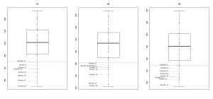
The solution provided did not work for me, but I could easily adapt it to my requirements. In my case I wanted to created a few boxplots that showed one property for 50 samples at different settings.
First you need to install and load the library wordcloud (also the feature image for this post was created with this library).
library(wordcloud)
To get similar data as I have in my current problem, I randomly generated three vectors (x2 and x3 depending on x1). The vectors have similar distribution but with different means and standard deviations. In each “setting” (vector) there is a threshold (here I used mean(x)-sd(x)) that should be reached. Each sample below this threshold should get a label, to see whether the same samples fail to reach the threshold for the different settings.
x1<-rnorm(50, 1200, 300)
x2<-x1-rnorm(50, 300, 50)
x3<-x1-rnorm(50, 400, 80)

xnames<-paste0("Sample_",1:50)
To create the single boxplots I created a function that does the actual work.
createBoxplotWithLabels<-function(x, name, xnames) {
  boxplot(x, main=name)
  points(rep(1, length(x)), x, pch=19, col=gray(0.3, 0.3))
  abline(h=mean(x)-sd(x), col="red", lty=2)
  low<-x<=(mean(x)-sd(x))
  textplot(rep(1, sum(low)), x[low], xnames[low], new=FALSE, col=gray(0.3), xlim=c(0, 0.8))
}
- Line 2: Create a box plot with a title.
- Line 3: Add the points to the box plot. I usually do this with my box plots when I want to show not only the properties of the box plot (median, quartiles, ...) but also each data point exactly. rep(1, length(x)) places the points at x=1, which is where the box is.
- Line 4: I create a dashed line to show my threshold
- Line 5: Get a vector of TRUE/FALSE that indicate which values are below the threshold.
- Line 6: This is the interesting part.
- sum(low) sums over the vector of TRUE (=1)/FALSE (=0) and gets the number of how many samples have a low value. You could also use length(which(low))
- new=FALSE has to be set, otherwise the text is not added to the plot but a new plot with the words is created (in some other methods, for example hist() for histograms this would be add=TRUE).
- xlim=c(0, 0.8) is the whole trick behind this plot. This library is actually designed to put the words directly at their position and not to be used as labels for dots. To get them somewhere beside box plot and still have the lines go to the correct points they are describing, you have to "tell" the function that the plot ends at 0.8.
This is how I created the images:
pdf("BoxplotsWithNonOverlappingLabels.pdf", width=15)
par(mfrow=c(1,3))
createBoxplotWithLabels(x1, "x1", xnames)
createBoxplotWithLabels(x2, "x2", xnames)
createBoxplotWithLabels(x3, "x3", xnames)
dev.off()

Here you can download the pdf.
The source code can be found in boxplotsWithNonOverlappingLabels.R.

