In this blog post I’ll show you how to fix a problem I had with displaying the list of markers below a map. The table that lists the markers was formatted completely wrong. For me this problem came up with Maps Marker (Pro) but it can also happen if you embed Google Maps. I’m using the WordPress theme twentyfifteen but I guess if you have this issue with another theme, the solution might work as well.
Some background info: As some of you might have noticed I am a fan of creating maps for different purposes, e.g. displaying my favourite food places or locations I have visited during my last vacation. I have used Google Maps before and later switched to Maps Marker (Pro) which is a WordPress plugin.
Here is a blog post (in German) about different ways to put a map in your blog posts.
Contents
The problem
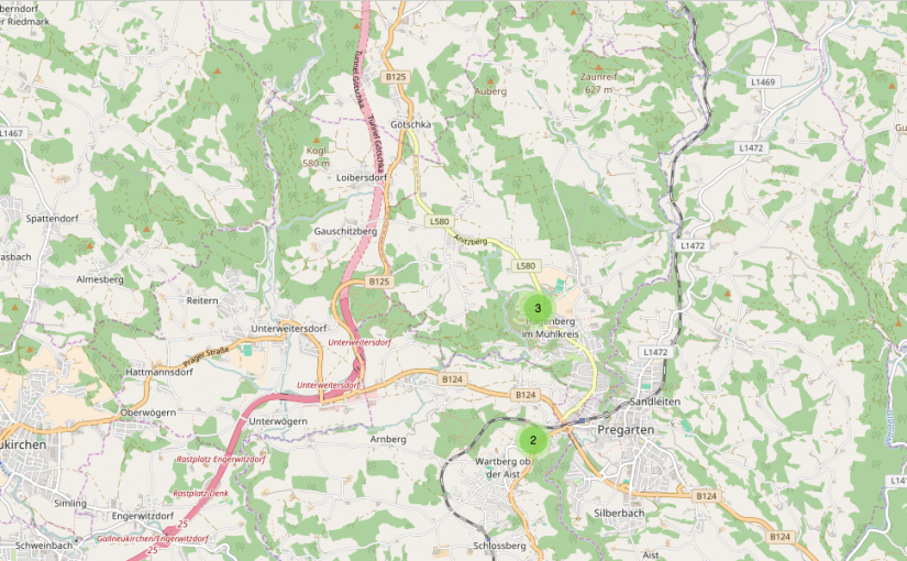
Previously I have only created maps without the list of markers below, like the following.
[mapsmarker layer=”1″]
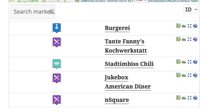
When I created my first map that should also show a list of the markers so that users can click on it, it looked not as I expected it.


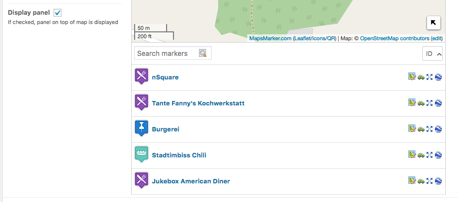
The main problem here is that the space to either side of the symbol is too wide and also the text is a lot larger than it should be. The first thing I noticed was that it looked different in the preview of the page than in the admin panel. So I thought that it must be a problem with a plugin or my theme.
Arriving at the solution
The first thing I did was to contact @MapsMarker on Twitter and I got an immediate response that I should create a ticket.
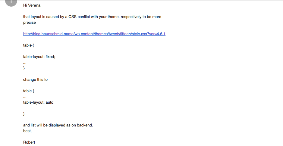
After I created the ticket I received a reply with the solution to my problem very quickly:

This seemed reasonable but I wanted to know more about the issue. So I was looking on Google for the the CSS property table-layout in combination with my theme “twentyfifteen”.
I found this helpful blogpost: Fix broken tables in twentyfifteen WordPress theme
From that I learned that this can also happen if you embed a map from Google Maps.
Fix maps marker lists
To fix it, I decided not to change this value for every table since the theme is designed that way. Using the Google Chrome Developer Tools I figured out what the class of the surrounding object was, so I could change only the tables that are below maps (see css selectors for more info).
I performed 3 steps to solve the problem in a nice way:
- Create a site specific plugin
- Place a .css file inside your plugin folder
- “Activate” that .css file
Site specific plugin
Using a site specific plugin is the recommended way of changing your site. I use one plugin that I called haunschmid.name to add all changes that I want to stay even if I change the theme of my site (e.g. code to include Google Analytics, inclusion of certain JavaScript files I need…).
I followed mainly those two tutorials:
- What, Why, and How-To’s of Creating a Site-Specific WordPress Plugin
- How to Create a Site Specific Plugin for your WordPress Site
.css file that fixes the bug
Inside the directory of my plugin I placed a .css file that I called fix_twentyfifteen.css. With .mapsmarker I make sure only the tables that come from mapsmarker are changed. I tried inherit and auto, both had the same effect.
.mapsmarker table {

    table-layout: inherit;

}
.lmm-listmarkers {
font-size: 13px;
}
“Activate” that .css file
If you just place the file there, nothing will happen. In the main file for the pluging, which is called haunschmid.name.php in my case, I had to add the following code. As long as the css file is in the directory of the plugin, this will add the path of the .css file inside the head-tag of your site.
add_action('wp_head', 'specific_css');
function specific_css() {
wp_register_style('fix_twentyfifteen', plugins_url('fix_twentyfifteen.css', FILE));
wp_enqueue_style('fix_twentyfifteen');
}
The fixed map
And here is how the map looks now. There is still a difference between this and how it’s displayed in the admin panel (e.g. the link color) but at the least the spacing is fine now.
[mapsmarker layer=”3″]
This didn’t work?
If this didn’t work or you ran into an issue or my explanations were simply too technical, please feel free to leave a comment!


Hi Verena,
thanks a lot for your detailled post, proposing a workaround for the CSS conflicts with twentyfifteen theme.
I took a look again at our CSS code and found, that a general fix should actually become available with the next release – so I just commited a proper fix based on your suggestions to our repository (in addition I also set a fixed font-size for the search box, which is also to large and removed the bottom border for all links on the map, which is also added by twentyfifteen theme).
You can apply the current changes by downloading the current leaflet.min.css file from our dev site at https://www.mapsmarker.com/dev/pro/wp-content/plugins/leaflet-maps-marker-pro/leaflet-dist/leaflet.min.css and overwritting the file on your webserver.
Anyway thanks a lot for your valuable feedback! As a small “thank you” I added another free year of access to updates and support to your license!
best regards & happy mapping 🙂
Robert
Hi Robert,
thanks for adding the changes directly to the plugin, this will make it easier 🙂
Awesome! I love your plugin and this gives me more time exploring all the awesome features! Thanks!
Best regards,
Verena
you’re welcome! if you have any additional questions or feedback let me know!