Pretty recently I found a paper with the title “Why Should I Trust You?”: Explaining the Predictions of Any Classifier. The topic of interpretability is very important in the times of complex machine learning models and it’s also related to my PhD topic (reliability of machine learning models). Therefore I wanted to play around with the method a little bit. The method that was introduced in the paper is called LIME (Local Interpretable Model-Agnostic Explanations) and comes with a python package. Luckily for me, someone already ported it to R (thomasp85/lime). In this post I will show how I used LIME on regression models.
Contents
What is LIME?
LIME is a tool for explaining what a complex (often called black-box) machine learning model does. This is achieved by learning simple (e.g. linear regression) models on perturbed input data to figure out which features are important. One example is to segment images into super pixels and then turning parts of them “off” (make them gray). This helps the explainer identify important features (e.g. regions of the image). The method does not only work for images, but also text and tabular data. LIME is model-agnostic, which means, that it does not matter which model you are using. To get a better and much more detailed explanation by the author himself, check out this article introducing LIME.
LIME and R
Before using lime in R, I recommend reading the vignette Understanding lime. The README and a comment on a reported issue state that the focus is classification, but that the package also covers regression. I have also noticed during my experiments that the plots are more intuitive for classification tasks (especially plot_features()) or only work for classification results (plot_explanations()).
My chosen dataset
Some time ago I stumbled over an advanced house prices dataset and since that I wanted to play around with it. Now I finally have a reason 😉 The dataset has 81 columns (including the target) and 1460 rows. So I guess there really is potential for advance regression techniques.
I chose it for exploring lime because it has many features (categorical and numerical ones), but is different than the datasets that are used in other tutorials/articles (usually text or images).
LIME on random forests for predicting house prices
Let’s look into the code I wrote for my analysis (markdown report and code).
Loading data & building a model
The first steps were loading the data and building a machine learning model. I chose to use random forests and the caret package.
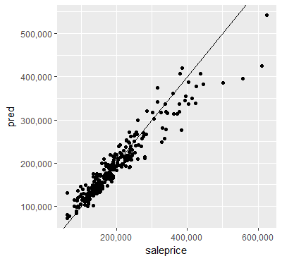
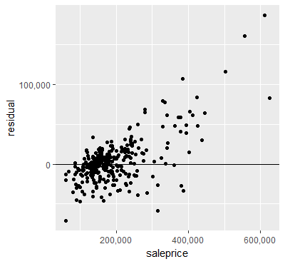
Since I do not compare several models, computing the RMSE or other measures didn’t make to much sense for me. Instead of that I created two plots to show the performance. The model works fine for cheaper houses, but it can easily be seen that it performs poorly for more expensieve houses.
Building an explainer & explanations
The explainer is built by using the method lime(). Then the explanations can be created with the method explain() by passing single samples, a subset of the samples or the whole test set.
lime() mainly gathers information about the data and stores it in the explainer object. It stores the type of column (factor, numeric, …) and computes distributions of the features (either using bins or mean and standard deviation, depending on the settings passed by the user).
explain() is the main part of the package in my opinion. In a first step, the samples of the test set get permuted. By default 5000 “new samples” are created for each sample. How the samples are permuted depends on some user settings and the data type of each feature. The user can decide whether continuous variables should be cut into bins or not. Then for each of the permuted samples a prediction is made using the trained machine learing model. The next step is where the magic happens. A loop iterates over each sample (of the test set). In each iteration all permutations of this sample are used to build a linear model only using a few features (n_features is also set by the user). There are different ways how the features can be selected, one of the methods is forward selection. In this step also the feature weights (which are the coefficients of the linear model) are computed. This will later tell us which features are the most important ones for a given new sample and also whether their influence is positive or negative. The return value of this method will be a data.frame with one row per sample and feature.
Visualising the model explanations
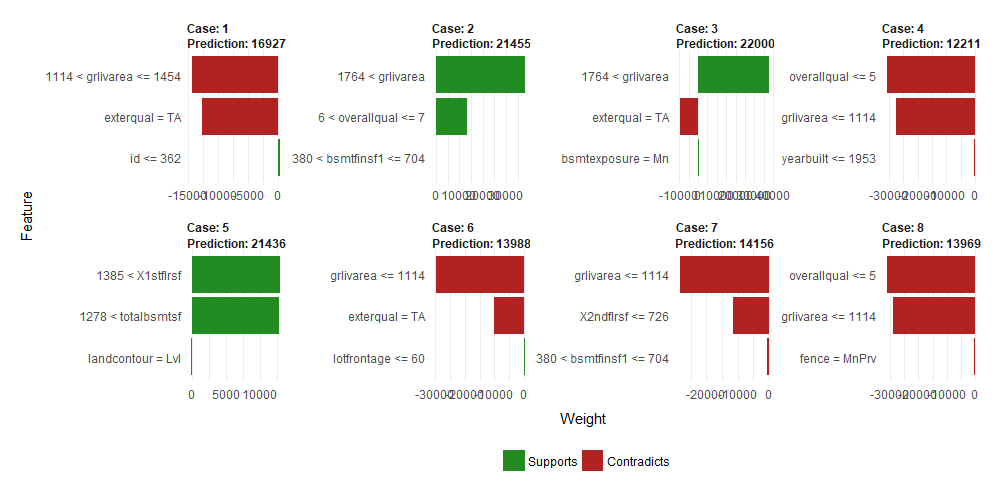
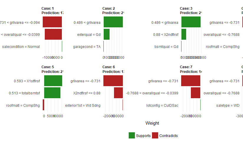
At first I was confused by the red and green bars. For classification it seems more intuitive to me. My interpretation for regression models (since the feature weights are the same as the coefficients of the local linear model) is that a negative bar just means that a larger value in this feature makes the predicted value smaller.
When you look at the plot and the features, this somehow makes sense. The feature “grlivarea” (above grade (ground) living area square feet) is important for many samples. And when the value is in the bin with the largest values (greater than 1764), the bar is green, since this increases the price. Other samples for which “grlivarea” is also important but smaller have a red bar since this decreases the selling price. It’s also interesting to compare Case 2 (overallqual = overall quality between 6 and 7) and Case 4 (overallqual lower than 5). “overallqual” is on a scale from 1 (Very Poor) to 10 (Very Excellent). For Case 4 the overall quality is “Average” or less, which decreases the prediction of the sale price. For Case 2 the quality is between “Above Average” and “Good” and this has a positive influence on the prediction of the sales price.
We can also see other interesting things in the graph. Only 2 features seem to be enough, because for each case the 3rd feature has a really low feature weight.
Perform analysis on scaled data
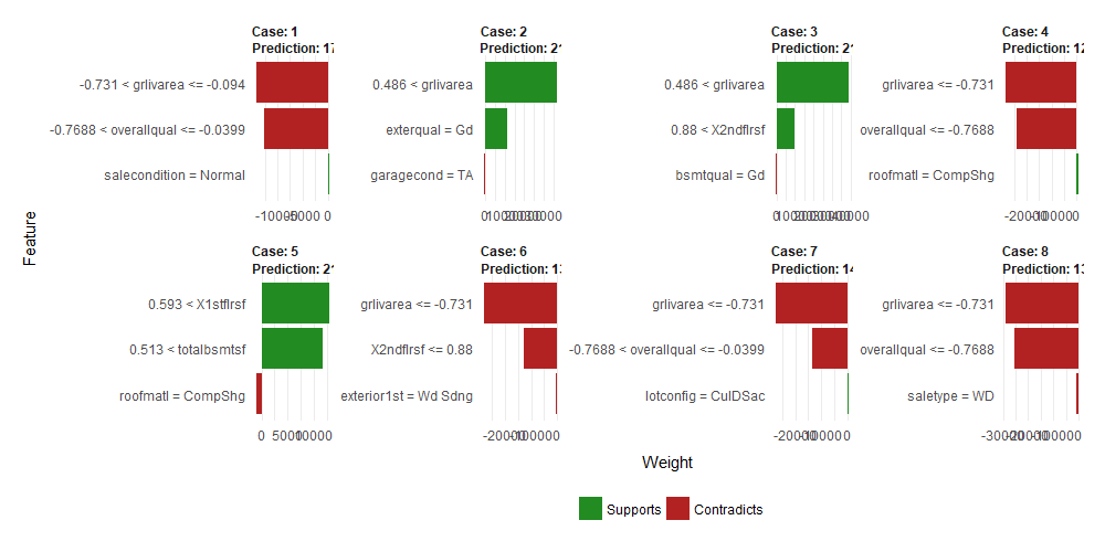
To get rid of features that might have a huge influence, I also did the analysis with scaled data.
When looking at the graph, one can see that the ranking and weights of the features changed a bit (but that can also be due to randomisation and not only because of scaling the features). It is still the case that only two features seem to explain most of the prediction. A big disadvantage is that the values of the features cannot be interepreted anymore easily, you would need to transform them back or look at the exact value of each sample if that is relevant.
Final remarks
It was quite interesting to read the paper and play around with the R implementation of the paper. I think that this method makes a lot of sense for classification (images, text, …) and I’m looking forward to using it on image data when the R package will also cover this functionality.
I’m not yet sure if my interpretation of the output for regression problems is correct but if it is, then it will also be a useful method for regression. In the case of using scaled data it would be very nice if the outputs (explanations and plots) could use the unscaled values in the feature descriptions to make it easier to interpret.
Now I’m curious what you think about the method. Have you heard about the paper before? Do you see a use case for local interpretable model-agnostic explanations?

Great. Thanks for sharing. Quick questions here: Why aren’t lime examples reproducible? Is there a way to add a seed? If we add more permutations the results are likely to be closer?
Is it necessary to scale data if we have very different ranges of values to do a correct analysis? Thanks again 🙂
Hi, thank you very much for your great questions! I did some experiments to find out, I plan to publish the code/results at some point but here are the answers because I don’t know wenn I’ll find time to do so 🙂
1) Why aren’t lime examples reproducible? Is there a way to add a seed? If you mean by reproducible that running the command twice will give the same results – it’s possible. You can not add a seed to the method directly, but setting the seed right before the function call will give you the same results again (see the following code piece).
set.seed(24)

explain(...)

set.seed(24)

explain(...)
2) If we add more permutations the results are likely to be closer? From my experiments it looks like it, yes. I didn’t do a statistical analysis (yet), but from what I saw if you have low n_permutations (like the default 5000), it might happen that features with a small feature_weight might change the sign and therefore the direction how they influence the prediction. I used n_permutations=50000 in my experiments and in that case the feature_weights always had the same sign and got closer between different tries.
3) Is it necessary to scale data if we have very different ranges of values to do a correct analysis? At first I thought so but after a few experiments it doesn’t seem to matter 🙂 However I didn’t figure out why that is the case so far. One thing I saw which I didn’t notice before is that for computing distances between the features the values get scaled (which makes sense especially if you use euclidean distances or something similar).
Thanks. Great post!
Am going to check LIME out – right after feeding the cats and getting the Apfelstrudel out of the oven 🙂
That sounds like a great plan, I can only approve of that 🙂
thank you for the post! Sam Ritchie also spoke at TWIMLAI on LIME https://twimlai.com/twiml-talk-73-exploring-black-box-predictions-sam-ritchie/ where he describes his use of it.
I wonder if someone will add this to WEKA…
Good article! I’m just trying out LIME for the first time on another regression problem and was coming to the same conclusion about interpretation in this case. And I hadn’t scaled my features yet, so was moving to that next, and you answered my questions there. All good stuff. 🙂
Thanks for publishing on this topic. I really like the reliability angle on ML and will tune into your blog to catch other insights along these lines.
Another solution to scaled input would be to scale the output as well. I was stuck with the same issue when I had to create explanability for a model with values between 0 and 1 as X and values ranging from 1000 to 100,000 as my Y.
Would anyone know if there would be a way to cancel explanation values that are not statisticaly significant?